Tags
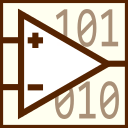
As a step in our ongoing effort to refresh our company image, we have updated our logo from informally using the Cheshire Cat, to a deliberately designed image that reflects our focus:
Our logo draws on the many interesting projects that straddle the border between the real world and the computer, or the interface between analog and digital. The symbol used is closest to the schematic symbol for an opamp, but could stand for any of several of the key electronic components in the path from a real phenomenon to a digital measurement. The random field of ones and zeros behind it of course stands for digital data.
You might notice an alternative version appearing at very small sizes, where clarity required the proportions and amount of detail to change. Here’s an enlarged view of the alternate form:
At even smaller sizes, the number of binary digits displayed decreases further, the opamp symbol becomes more abstract, and the colors more bold.
On a whimsical note, we should thank the Cheshire Cat for his years of service as unofficial company mascot. I’m sure he’ll continue to fade in and out from time to time, but we won’t ask him to stand up and grin in quite so many places.
![John Tenniel [Public domain], via Wikimedia Commons](https://upload.wikimedia.org/wikipedia/commons/5/56/Cheshire_Cat_vanishing_%28detail%29.jpg)
(Detail from the Cheshire cat vanishing in Lewis Carroll’s Alice in Wonderland drawn by Sir John Tenniel)


