
This post shows a couple of plots of SPL over time, using a SPLear™ sound level measurement module connected to a Raspberry Pi. Drawn by gnuplot in the RPi. A future post will talk in detail about how to automate this.
This is part of our series of articles on the general subject of audio signal processing from air to information.
But first, two pictures

Here, I clapped three times within a foot of the SPLear. Looks like I need to practice my rhythm, or perhaps actually try to clap evenly. I’ve also fixed a bug in the capture script so that it triggers on the first clap, not the last.
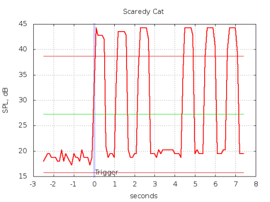
I held a typical smoke alarm near the SPLear and triggered its test mode. The plot shows the distinctive cadence of fire and smoke alarms: three beeps and a pause, repeating.
I failed to measure the distance to the alarm, so the peak SPL values recorded don’t really have much physical meaning other than to note that the alarm was loud. In a later post, I’ll repeat this with the alarm at various distances, and attempt to show the expected linear relationship between distance and measured SPL.
Background
The SPLear measures sound pressure level (SPL) from ambient sound with a MEMS PDM microphone, and reports that measurement to the Raspberry Pi using a UART. A program in the RPi captures the SPL reports, triggers on a loud event, and invokes gnuplot on the data.
Much of the firmware has been discussed and published in past posts on this blog, and the source code is available from a public repository. The firmware used here is checked in as [3b4f54236e].
The script from our last installment does a fair job of only sending mail on sudden loud noises. But the email is rather dull, consisting of only a couple dozen recent SPL readings as plain text. It would be better to send some sort of graphic that can be interpreted to decide if the noise was just something being knocked over, or something more serious like a ringing alarm.
Drawing pretty pictures
We used gnuplot to plot the SPL data. Gnuplot1 is a widely used, powerful, portable, and somewhat complicated tool that plots data. In addition to the simple plot with some annotations we drew, it can do some really amazing things.
Install gnuplot on Raspbian with sudo apt-get install gnuplot.
It is controlled by a declarative scripting language of its own. In addition to plotting the samples, we just need to label the axes and plot, so our script isn’t too complicated. We also annotate the plot with lines showing the mean SPL as well as plus and minus one standard deviation from the mean, and with a bold mark at the trigger.
With 100 points of SPL data in tmp.dat, a gnuplot script which does this looks like this:
# Configuration
trigger=2.6
datafile="tmp.data"
outfile="plot.png"
set terminal push

# Graph Title, Axis labels, key and grid
set title "Scaredy Cat"
set xlabel "seconds"
set ylabel "SPL, dB"
set key off
set grid xtics ytics

# Compute mean and sd by cheating with a constant function fit to the
# data.
f(x) = mean_y
fit f(x) datafile via mean_y
stddev_y = sqrt(FIT_WSSR / (FIT_NDF + 1 ))

# Plot to a PNG file
set terminal png
set output outfile

# label a vertical line at trigger time, which will be at x=0 after
# transformations
set label 1 "Trigger" at 0, graph 0 offset character 0.25,0.5
set arrow 1 from 0, graph 0 to 0, graph 1 nohead linewidth 5 lc rgb "#ccccff"

# plot with stddev bounds and mean, scaling and offsetting x to
# seconds with x=0 at the trigger
plot datafile using ($1/10 - trigger):2 with lines linewidth 2.5,
        mean_y with lines lc rgb "#00dd00",
        mean_y-stddev_y with lines lc rgb "#dd0000",
        mean_y+stddev_y with lines lc rgb "#dd0000"

# Close the PNG file and restore the terminal to its prior setting
set output
set terminal pop
There’s a few details worth noting in this script.
The data collection numbered the samples with integers. Since gnuplot also does that, it could have omitted those sample numbers entirely. A future version of the SPL recorder will identify samples with a time stamp instead, making the ($1/10 - trigger) expression in the plot command simpler.
When automated, the plot title should probably include the full date and time of the event, so the plot stands alone. It probably also should get some string settable by the end user to identify the location for similar reasons.
The arrow annotation is used to draw the vertical marker at the trigger time, using the trick provided by the graph coordinate system to draw it across the entire plot regardless of the scale. graph 0,0 is the lower left corner of the plot, and graph 1,1 is the upper right corner. Here, we’ve only applied graph to the y coordinates so that the x coordinate is treated the same as any data point.
We used the fit command to compute the mean, by having it fit a constant function to the data. That sets the variable mean_y. As a side effect, fit also sets a bunch of variables with information about the data and the fit. Two of those permit the calculation of stddev_y.
What Now?
The next post will explain in greater detail how to fully automate the SPL capture, plot, and email the finished image.
Beyond that, we will continue to find interesting things to do with the measured SPL level, which will certainly be the subject of future posts. Watch this space!
Please let us know what you think about the SPLear!
If you have a project involving embedded systems, micro-controllers, electronics design, audio, video, or more we can help. Check out our main site and call or email us with your needs. No project is too small!
+1 626 303-1602
Cheshire Engineering Corp.
120 W Olive Ave
Monrovia, CA 91016
(Written with StackEdit.)
- Despite the use of “gnu” in its name, gnuplot is not related to “GNU” (the operating system project) or “gnu” (the animal). It replaced a utility named “plot”, so it was “new”, and apparently the name seemed obvious at the time. The GNU (GNU is Not Unix) project independently picked on the same animal for its naming. ↩
